Week 20
The last few weeks have been all about fun with it being the Halloween season. This week we’re going to buckle down and tackle the photography concept of utilizing contrast to create dramatic images that draw the eye.
The prompt card specifically named high contrast lighting, or tonal contrast, so we will start there. I want to take it a bit further and discuss the other 2 types of high contrast photos which are color contrast and conceptual contrast.
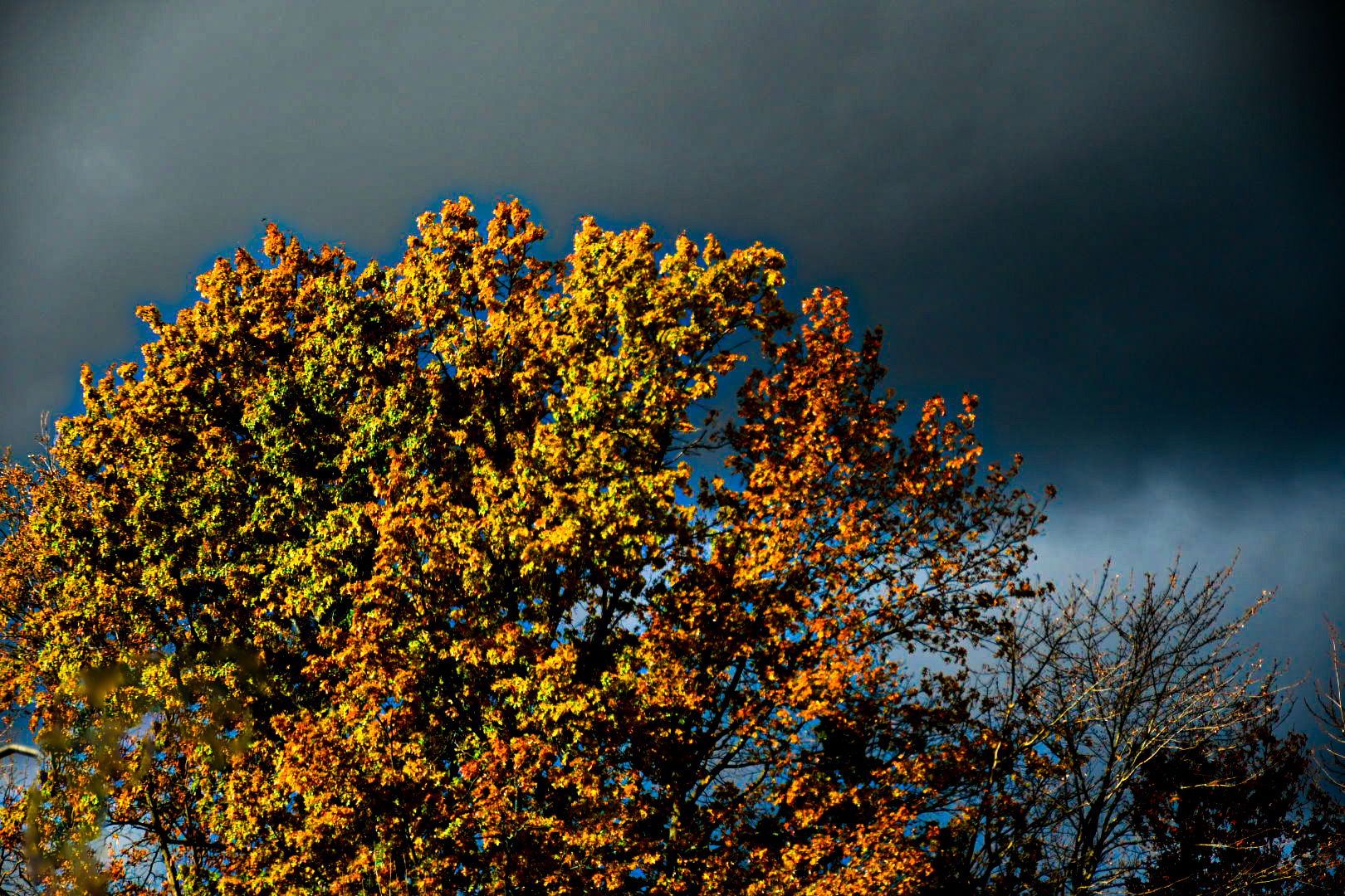
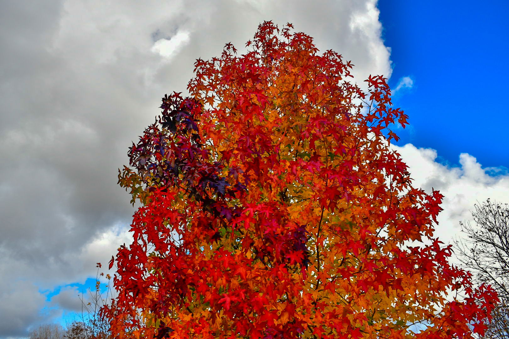
These two photos were taken at sunrise as storm clouds cleared. The first produced a bright sunlit tree against a dark grey sky. The second captures the remaining shadows that are soon to disappear when the sun rises a bit higher.
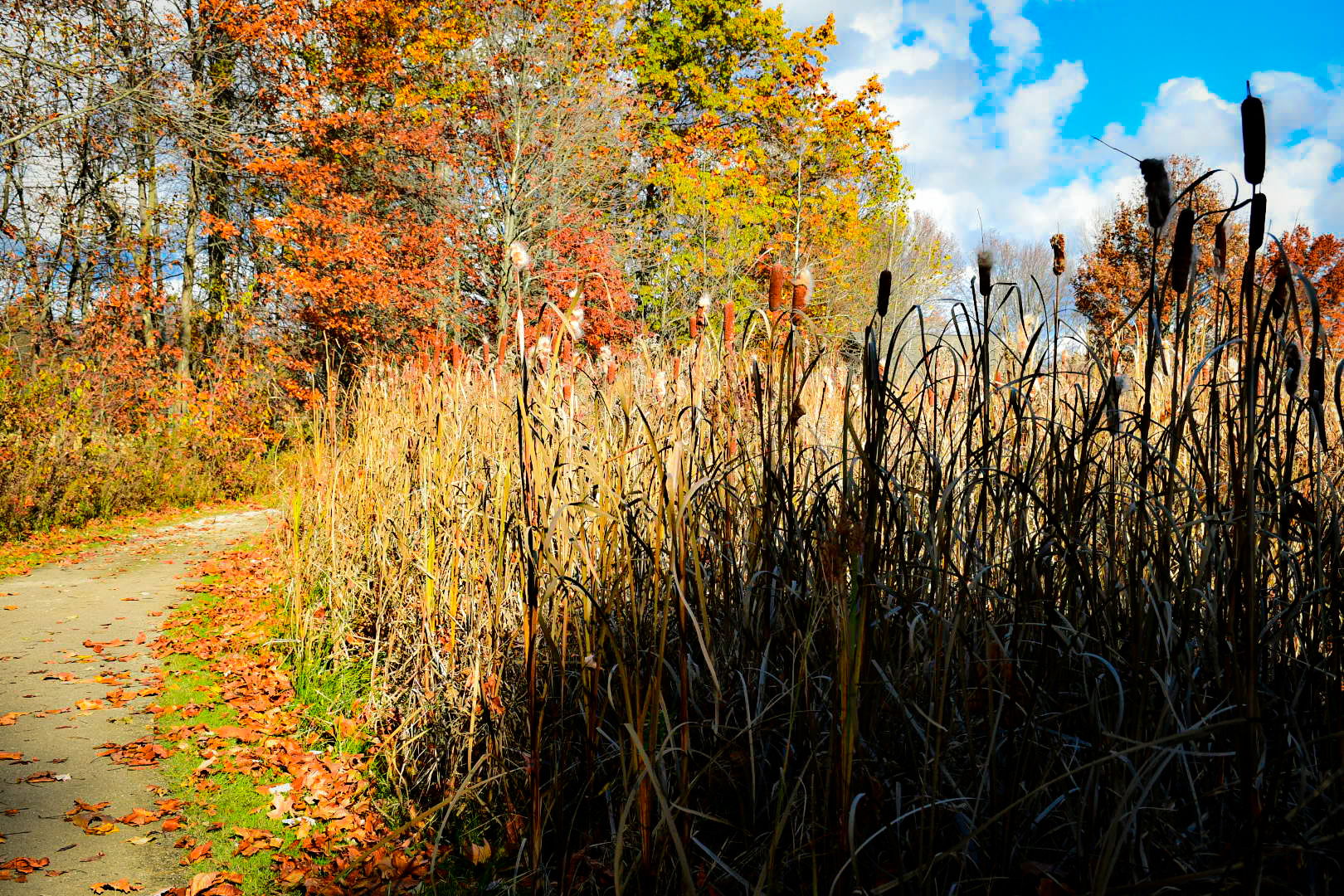
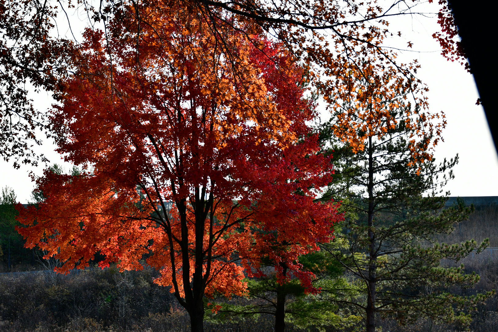
This photo shows only the tallest plants being highlighted with sunlight while the rest remain in the shadows.

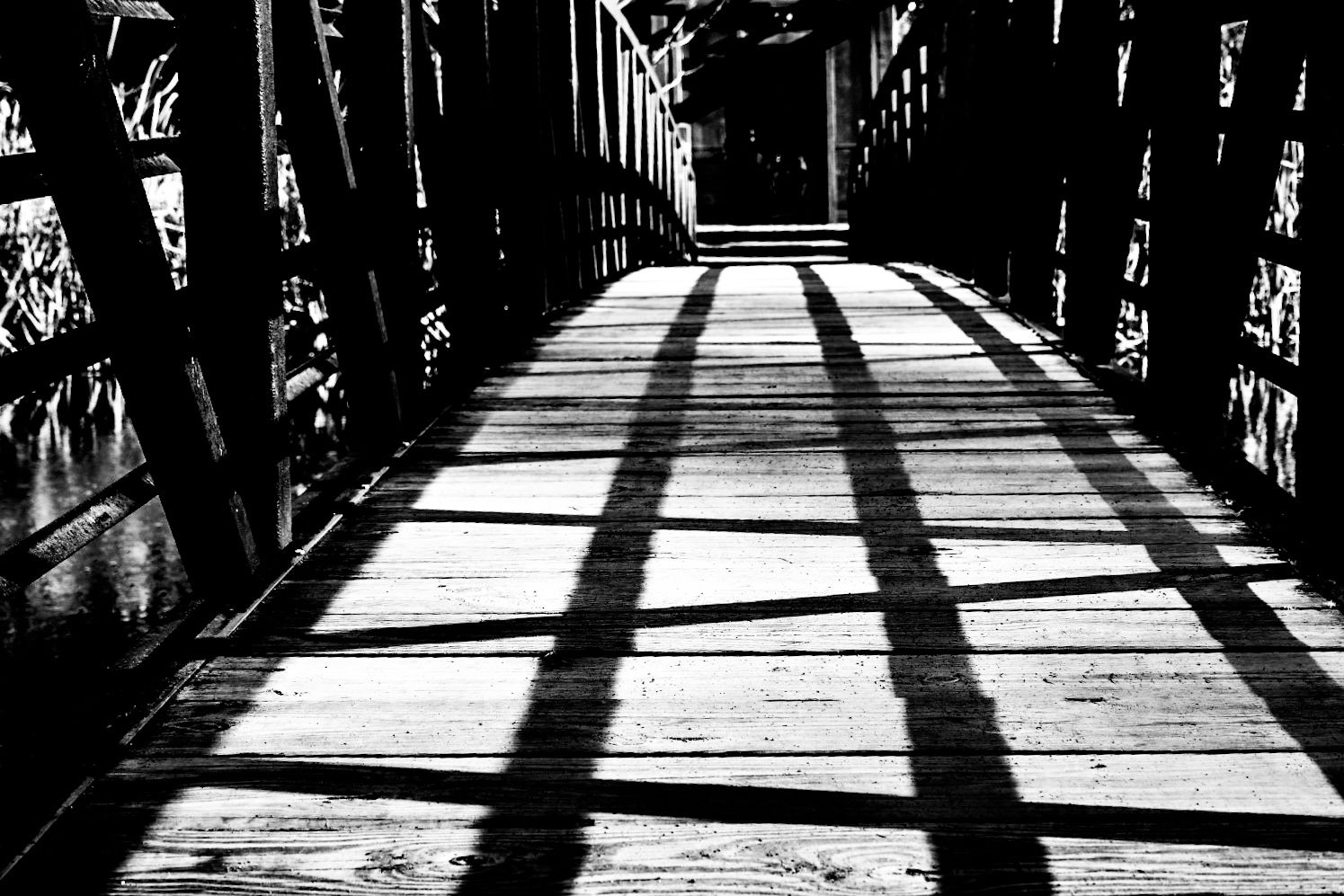
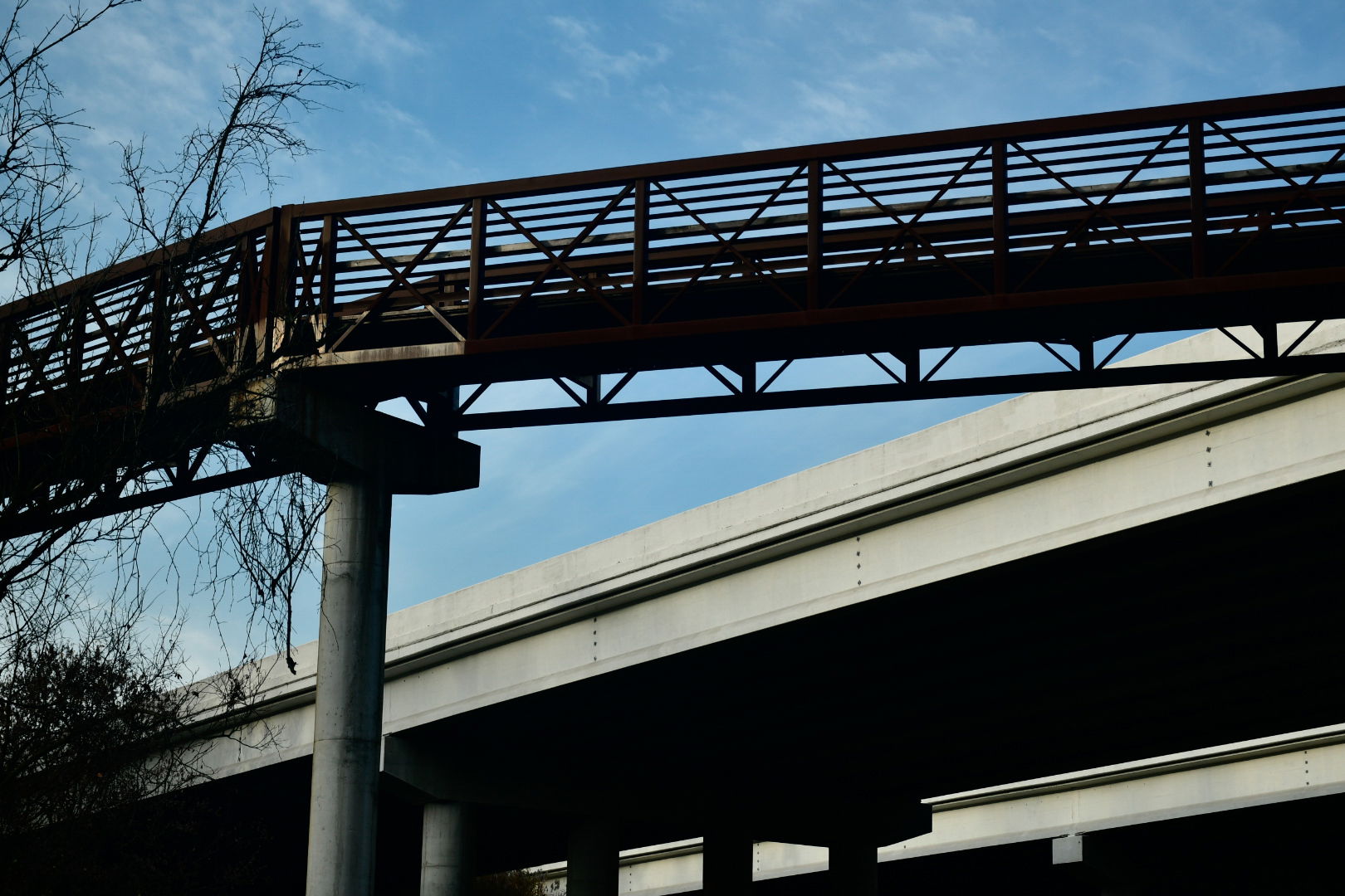
The following photo demonstrates a tic tac toe pattern produced by the framework of the bridge.
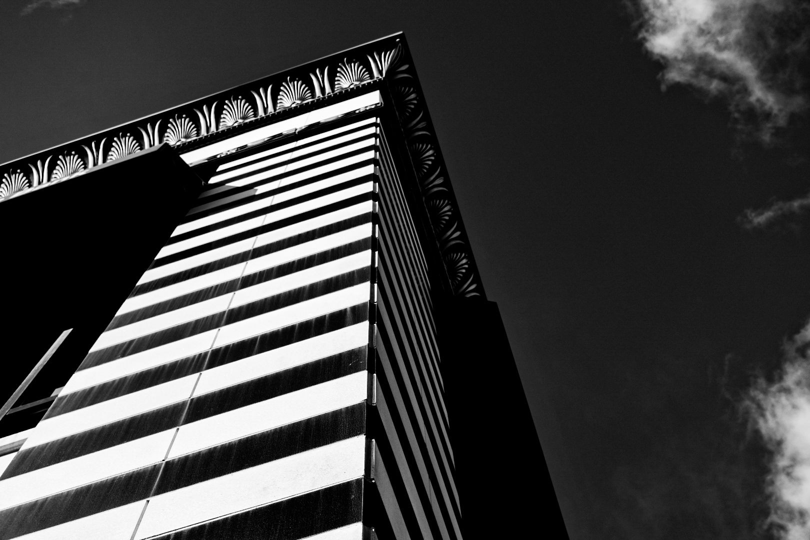
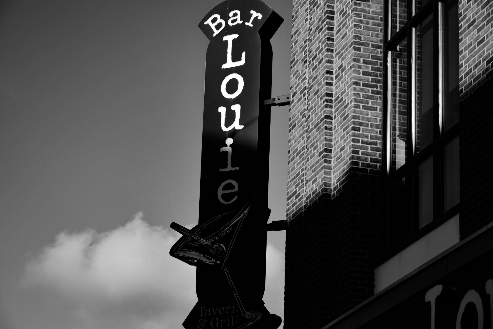
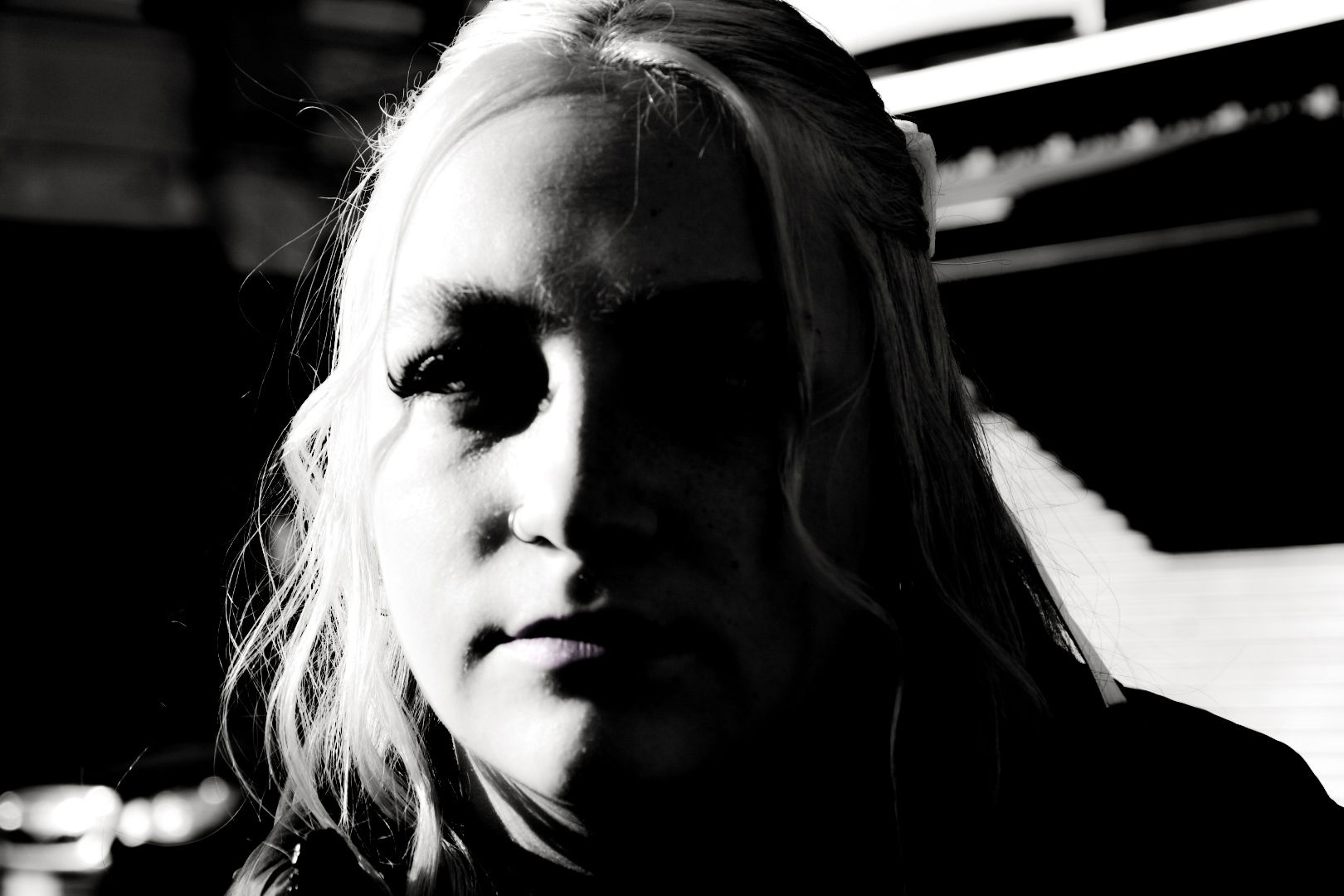
These next six photos were taken at crocker park in full sunlight, giving me plenty of opportunity to seek out high contrast lighting situations. The last one was taken accidentally while on the escalator! And thank you to my daughter for lending me her beautiful face! I also want to point out the difference in the bar Louie sign for showing horizontal contrast while the rest are vertical.


The second category of contrast photography is color contrast. To find true contrasting colors, we use the color wheel theory. True contrasting colors are exactly opposite each other on the wheel.

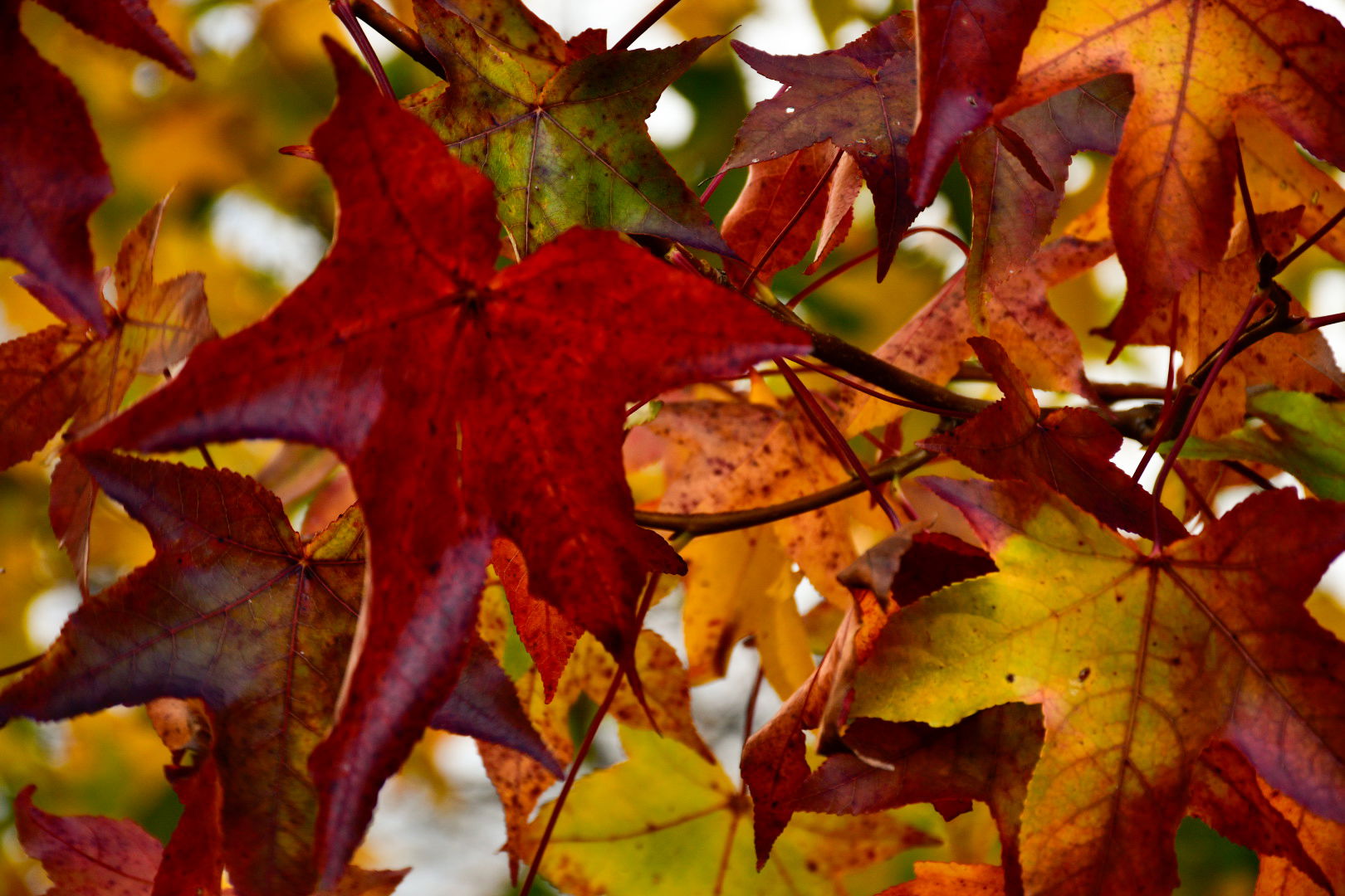
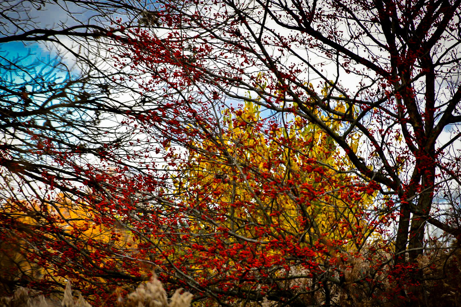
The fact that it’s fall made red and green pretty easy to find as illustrated by these three photos. There is no denying that the contrast of red and green leaves on a single tree makes for a stunning view. Your eye is drawn to it before the others. The green tree behind the red berries was also an eye catcher.
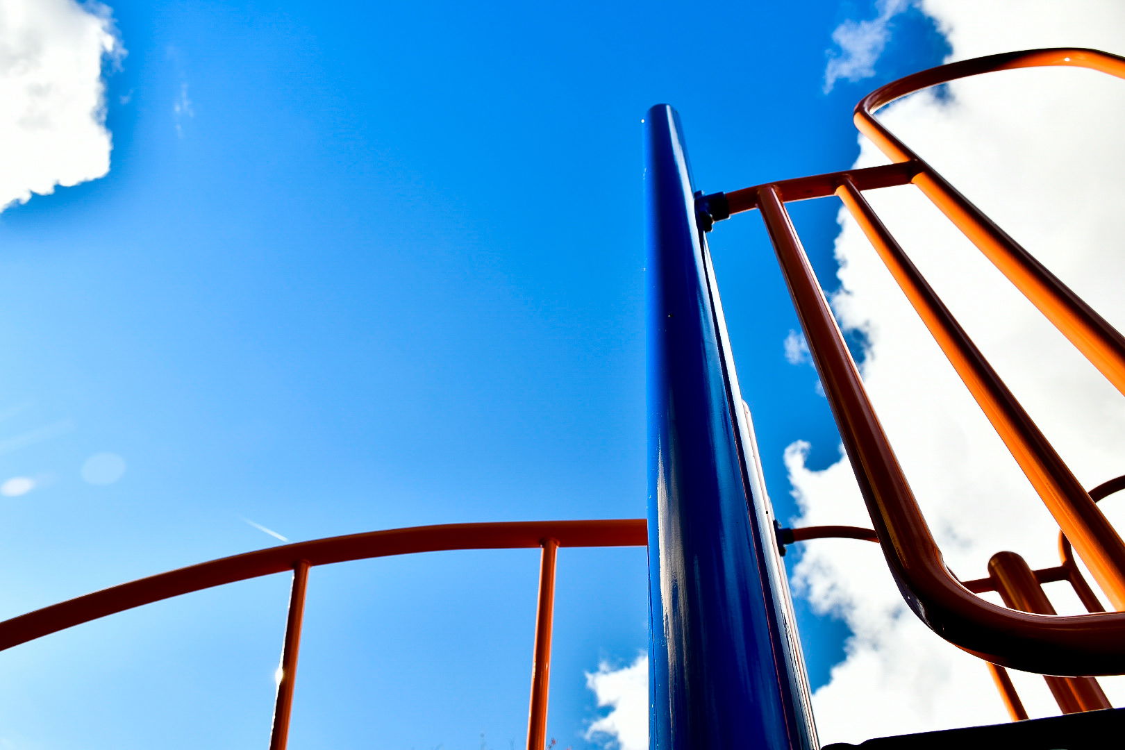
I found orange and blue along the leaves contrasted against the sky. I then noticed that the playground equipment was blue and orange. These contrasting colors make the playground fun and inviting!

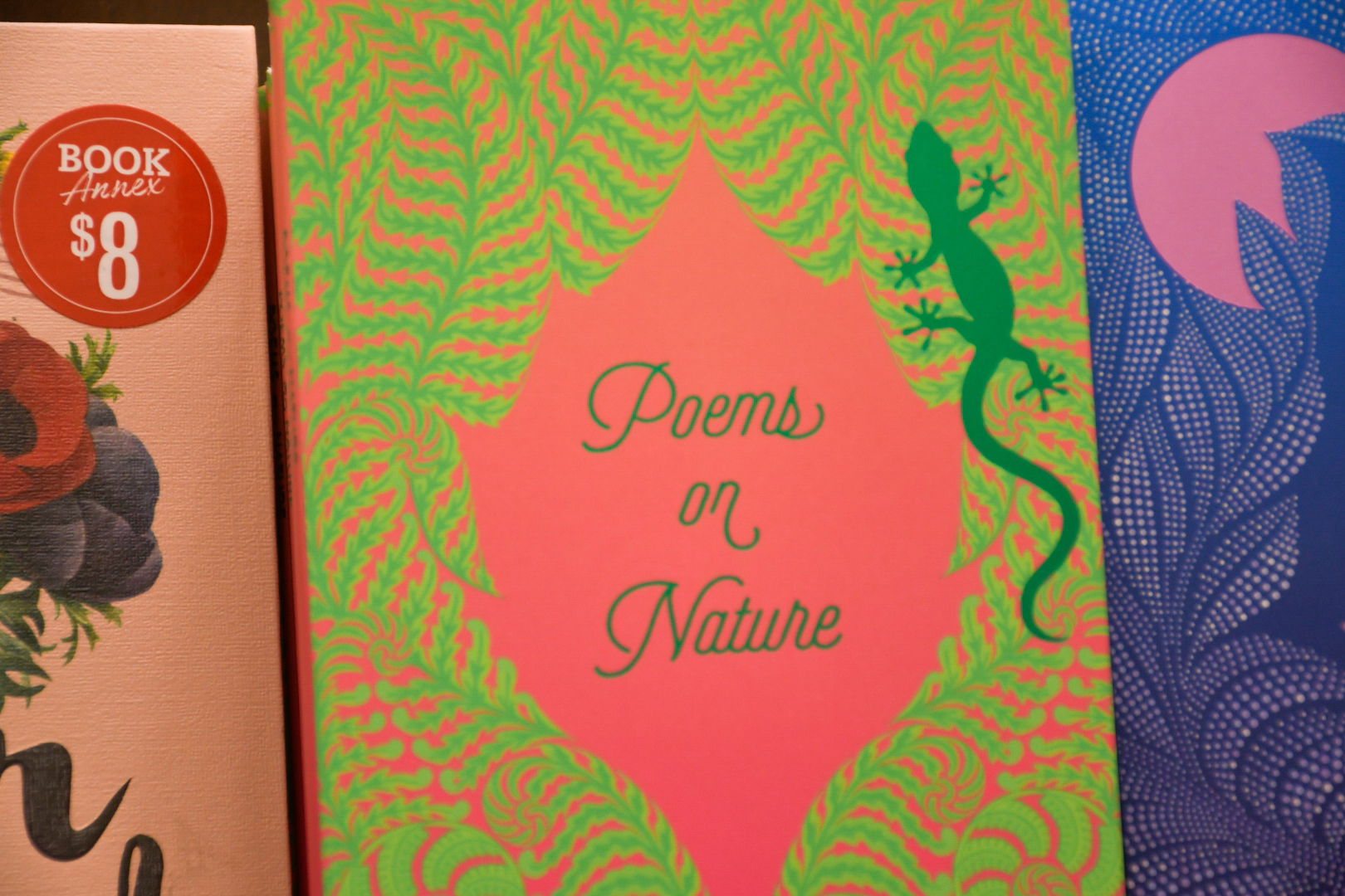
I noticed contrasting colors being used frequently in advertising. No doubt for their eye catching quality. For instance, I took notice of this pink and green book at Barnes and Noble before I paid any attention to the books beside it. This flower shop in Lagrange took advantage of the contrasting colors of yellow and purple to draw toe eyes to their sign, a technique also used by Taco Bell and Planet Fitness.

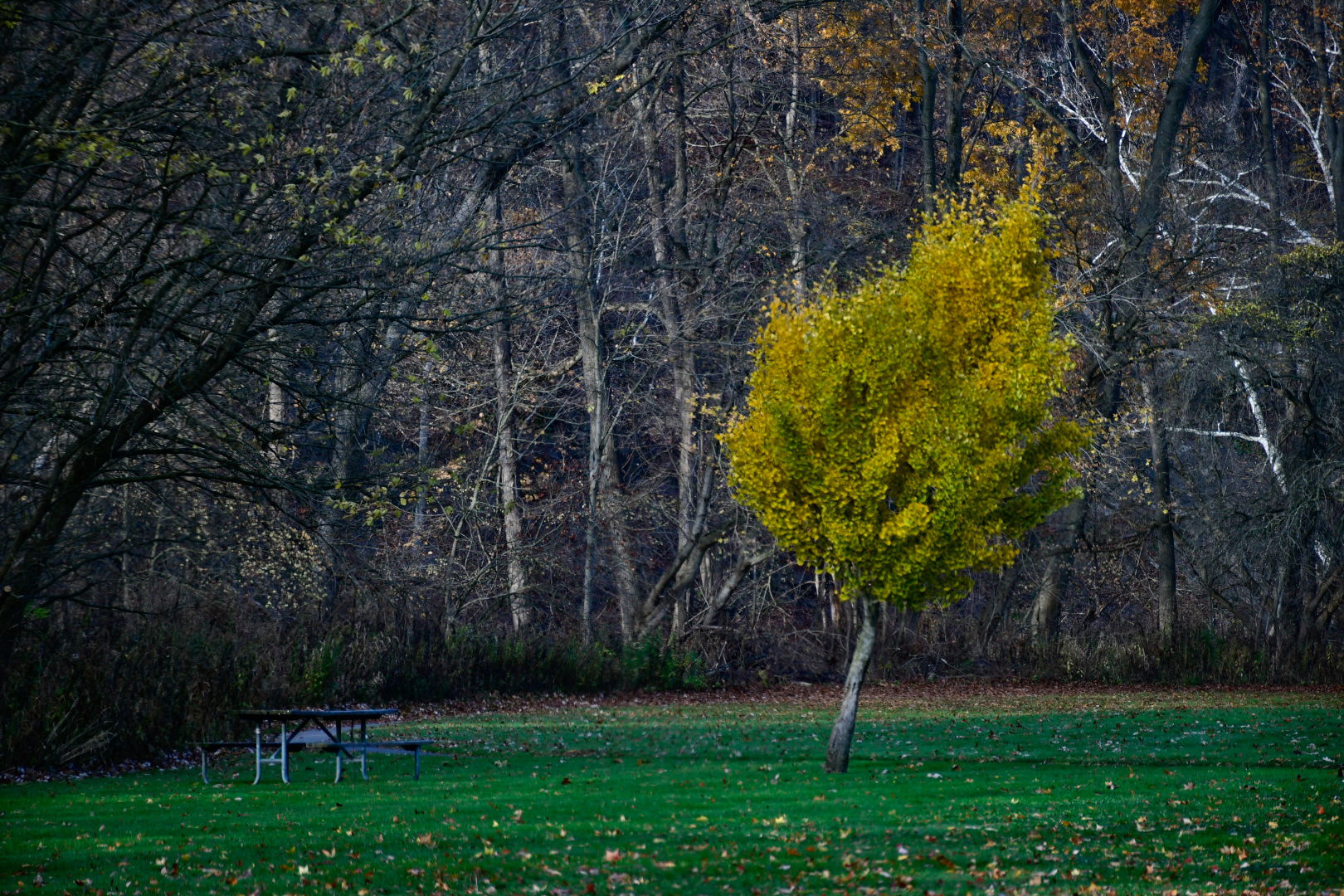
Now for the third category on contract photography; conceptual contrast. Conceptual contrast adds depth and interest to an image. A single green tree standing in front of a row of bare trees and a dead tree in front of a vibrant fall tree adds an element of wonder to these photos. An old footbridge by itself- cool. A newer highway bridge by itself- cool. Them being together in one photo evokes thought and potential stories. The last photo is of me posing outside a cave at cascade park. It makes me look small, and the size contrast illustrates how large the cave really is. By itself it would be just a cave of unknown proportions.


Click below for an excellent article on contrast photography. Drop me a comment and tell me what you think!
https://www.adobe.com/creativecloud/photography/discover/high-contrast-photography.html